
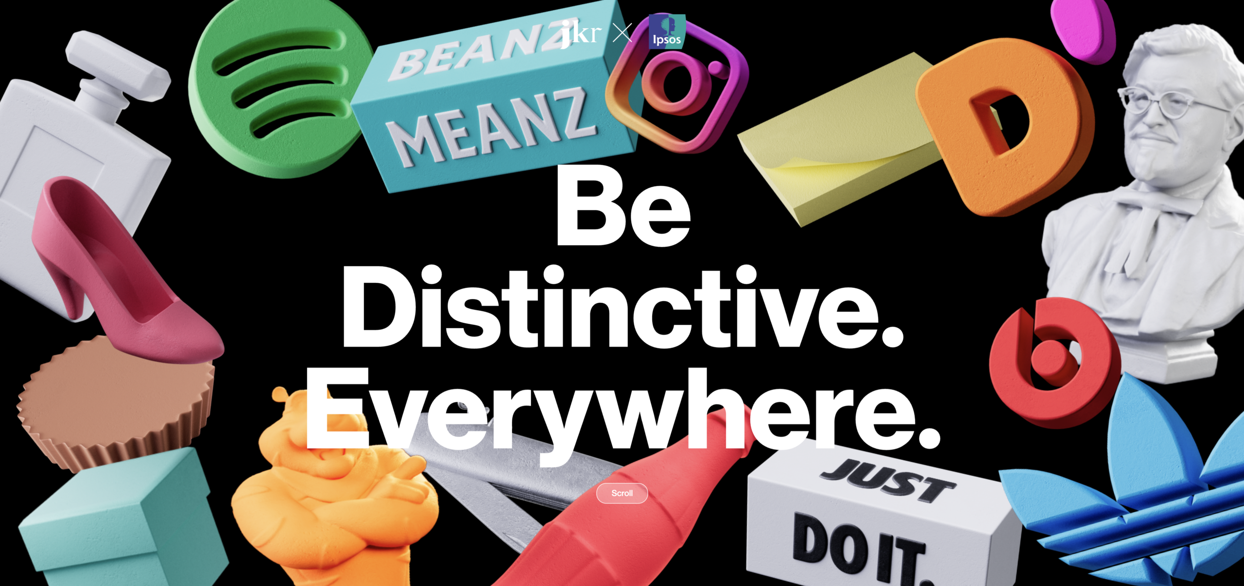

An autopsy of JKR x Kantar’s “Be Distinctive Everywhere: The Experience Edition” (2026)
There’s a report going around. JKR and Kantar launched it at Cannes in June 2026, the same week Sharp and Ritson finally shared a stage. The headline is everywhere on LinkedIn: only 28% of brand equity is built by paid media. 71% is built by experience. Earned media does 41% of the work. Owned experience does 30%. And brands that improve their experience are 2.5x more likely to grow share.
It’s a good headline. It feels true. It flatters everyone who ever said advertising is overrated, and it lands on the right side of an argument I’ve been making for years. What builds a brand is what a company does, repeated, not what it says.
So I should be the report’s best friend. I’m not, and the reason matters more than the agreement. I read all 78 pages. Then I did the two things the report didn’t do. I checked the number against a century of evidence and who paid for the answer. Here’s the honest verdict. The direction is roughly right. The numbers aren’t measurements. They’re a survey of what people remember and are willing to say, and a survey is the one instrument that cannot see the thing this report claims to measure. And the two firms who built it sell exactly what it tells you to buy.
Let me show you, piece by piece. I’ll credit what’s right before I name what’s wrong, because the point isn’t to win an argument. It’s to stop a good operator from cutting their paid budget on a number that can’t hold the weight.
Start with the thing the report gets right
I’m not going to pretend experience doesn’t matter. My whole argument is that it does. The brand is built into what the company actually does, or it isn’t built at all. And the hard evidence backs the direction.
- Word of mouth genuinely moves sales. Not soft. Shown with real behaviour and proper controls. Online reviews shifting sales from one retailer to another (Chevalier & Mayzlin, 2006). Word of mouth driving signups with a long-run effect far bigger than ads in that setting (Trusov, Bucklin & Pauwels, 2009).
- The marginal punch of an ad dollar is genuinely modest. A century of econometrics agrees. Short-term advertising elasticity sits around 0.12. Spend up 1%, sales move about a tenth of a percent (Sethuraman, Tellis & Briesch, 2011).
So if the report had said experience is underrated, advertising isn’t magic, build the thing into the product, I’d have signed it. That’s the floor I already stand on. But it didn’t stop there. It put four precise numbers on the wall and sold them as fact. That’s where it breaks, and it breaks in three layers, each one deeper than the last.
Layer one: the clean split can’t hold
Look at what their own buckets actually contain (report transcript).
- Paid (28%). Advertising you buy.
- Owned (30%). Direct experiences, “what they see and feel for themselves.”
- Earned (41%). Indirect experiences. In plain English: word of mouth, reviews, social. What other people say.
Worth noticing: the biggest number in the report, 41%, is other people’s words. You could read that as a point against a report that drums “actions over words.” I won’t lean on it, because the honest read runs the other way. Earned media is strangers repeating what your actions made them feel. It’s downstream of what you do. A big earned number is consistent with actions building the brand, not a refutation of it. If anything, it sits closer to my side of the table than theirs.
The real problem with the split is that the slices aren’t separable in the first place. The buckets don’t hold still. Word of mouth doesn’t fall from the sky. Advertising creates it (Kent, Trusov & Bucklin, 2020), and direct experience is read through the expectations that advertising sets (Hoch & Deighton, 1989). So one dollar of paid shows up again as “earned” and a third time as “owned,” and gets credited to both. You can’t slice a blended thing into clean wedges. The pie chart is the lie before you even check it against the world.
Layer two: it’s a survey, and a survey can’t see what builds a brand
Here’s what the headline never tells you. The 28/41/30 split comes from one place. Kantar Connect, Kantar’s own tool. People are asked which touchpoints they ran into and how much each one shaped their view. A regression turns those answers into “% of brand equity.” (Kantar Connect whitepaper)
That is a survey asking people to explain their own behaviour. And people can’t do that. Not won’t. Can’t. I’ve written this before, and the science is brutal on the point. A survey lives in the slow, talking, explaining part of the mind. Buying runs on the fast, wired part. Ask someone why they chose something, and you don’t get data; you get a story, and the story is wrong in a direction you can predict every time.
This isn’t opinion. It’s the most replicated finding in the field.
- People have no access to why they did things. Manipulate a choice in plain sight, and subjects confidently invent a reason that has nothing to do with the real cause, then deny the real one to your face (Nisbett & Wilson, 1977). This is the “we start with your website” answer every buyer gives, and no buyer means.
- Ads work without being remembered. Mere exposure builds liking with zero recall (Zajonc, 1968). Most advertising is processed at low attention. The feeling sticks; the memory of the ad doesn’t (Heath & Nairn, 2005).
- The “it was an ad” tag fades faster than the persuasion. So ad-built preference gets re-filed under “I just like it” or “a friend told me.” The sleeper effect, source forgetting (Bell et al., 2021).
- Admitting an ad worked on you is low-status. “I did my research” is high-status. People quietly launder advertising into “earned.”
Every one of these pushes the same way. Paid gets undercounted. Experience and word of mouth get overcounted. Every time. The 28% isn’t a measure of what advertising did. It’s a measure of how invisible advertising is to memory. The survey was going to produce this answer no matter what actually built the brand.
And here’s the part that connects straight to the soda scanner. The McClure study put it beyond argument. Choice runs on a wired memory, not on the product. The Coke label moved people three-quarters of the time, and when you damage the brain’s wiring for it, the effect vanishes (McClure et al., Neuron, 2004, and Koenigs & Tranel, 2008). The buyer can’t introspect on that wiring. It fires below the level a survey can reach. So a survey asking “what influenced you” is interviewing the one part of the mind that wasn’t in the room when the decision was made. It’s surveying the narrator about a decision the wiring made without him.
There’s a defence Kantar would reach for here, and it’s worth answering before they raise it. They’d say: brand equity is an attitudinal thing, attitudes are exactly what surveys measure, so you’re attacking us for not measuring behaviour when equity isn’t behaviour. Fair, as far as it goes, but here’s the hinge. A survey can measure how much someone likes a brand. It cannot measure what made them like it. The 28/41/30 isn’t a liking score. It’s a causal claim about which touchpoints built the liking, spread across paid, owned, and earned. Measuring the level of equity is legitimate. Measuring its source by asking people to name the touchpoint that moved them is the exact introspection the science says is fiction. Concede the level. Deny the source. That’s the whole argument in one line.
Layer three: even with better data than Kantar has, this method is wildly wrong
We don’t have to argue it in theory. When researchers run actual experiments, switch marketing on and off, watch real behaviour, and compare that to what attribution models claimed:
- eBay turned off paid search in a controlled test. The attribution model said +4,173% ROI. The experiment said −63%. The sign was wrong, not just the size (Blake, Nosko & Tadelis, 2015).
- Across 663 Facebook experiments, even models with 5,000+ data points per person overstated ad effects by 3 to 6x versus ground truth (Gordon, Moakler & Zettelmeyer, 2022).
- Ad effects are so small relative to the noise in sales that even experiments involving millions of people often can’t pin them down (Lewis & Rao, 2015).
Sit with that.
Gold-standard experiments, real behaviour, mountains of data, and attribution still miss by orders of magnitude. The Kantar number has none of that. No experiment. No behaviour. Just recall. The 28% has no margin of error you could even calculate. It’s a confident dot in a fog.
There’s a tension here a sharp reader will spot, so let me close it before it gets used against me. Layer two says the survey under-counts paid. Layer three says attribution models over-count paid. So which is it? Both, and they’re measuring different things. Digital attribution overstates paid’s short-term sales punch, the last click that gets the credit. The equity survey understates paid’s long-term brand-building, because the ad that built the preference is forgotten by the time you ask. This is the long and short of it (Binet & Field, IPA). The deeper point holds either way. The instruments fail in opposite directions because neither is measuring the actual cause. One fishes in short-term sales noise, the other in faulty memory. The errors don’t even agree with each other, which means there’s no stable bias to correct for. You can’t adjust the 28% up or down to a true number, because there is no true error to back out. A confident point estimate is unjustified in either direction. Trust none of them.
What the survey could never see: cheap wiring versus costly wiring
This is the deepest cut, and it’s the one the report doesn’t even know it’s missing. Brands get built by repetition. Co-activation, over and over, until the pattern holds in a buyer’s head. But there are two kinds of repetition, and they are not the same thing.
Cheap wiring is a logo and an ad on repeat. Anyone with a budget and enough years can lay it down, and the next budget lays the same one right beside it. Costly wiring is a decade of decisions a company would bleed to fake. The refusal of margin. The product killed instead of harvested. The operating choice that cost real revenue. Expensive to lay down, and expensive to copy, because a rival has to live through the same decade to match it. Costco capping its own markup. Red Bull’s three-billion-euro media machine. Patagonia putting the company in a trust. A rival can copy the slogan by morning and can’t copy the structure without tearing up its own income statement.
Now here’s why this guts the report. The buyer never sees the costly decision directly. They don’t read your capital allocation. They see the consequence. The price that’s always fair, the jacket that lasts, the can that means “fast and dangerous.” The signal wires them through what they can perceive, not through what they can name. So when Kantar’s survey asks “which touchpoint influenced you,” the costly wiring, the part that actually defends a premium, is doubly invisible. It fires below recall and reaches the buyer disguised as an ordinary experience.
So the 71% labelled “experience” is a black box. Some of it is costly wiring (real, durable, defensible). Some of it is cheap wiring relabeled (a logo people half-remember). Some of it is paid media that got laundered into “earned.” The survey can’t tell these apart, and the difference between them is the entire difference between a brand you can defend and one you can’t. The report measured that a wire exists. It is silent on which kind of wire it is. That silence is where the strategy lives.
The 2.5x points the wrong way, and the size control doesn’t save it
The other headline, improve experience and you’re 2.5x more likely to grow share, is a correlation. The report says it adjusted for brand size, and that matters, so let me take it seriously rather than wave Double Jeopardy at it.
Double Jeopardy is the background fact: bigger brands automatically score better on nearly everything: more buyers, slightly more loyalty, better satisfaction, better experience scores. Loyalty and experience read as outputs of being big. They come along with size rather than produce it (Ehrenberg, Goodhardt & Barwise, 1990; Sharp, How Brands Grow). A crude size adjustment removes some of that. So the size control isn’t where I’d attack.
The gap it can’t close is time.
The cause-and-effect runs backwards, and it’s about timing. The brands that gained share also scored better on experience during the same stretch, because winning makes everything look good. Happy customers, better reviews, higher scores. So a better experience score might be the result of growth, not the reason for it. The report adjusts for how big each brand is today, but that doesn’t help. Knowing a brand’s size right now tells you nothing about what came first. Did the experience improve and then the share grew, or did the share grow and drag the score up with it? To prove their claim, they’d have to show that experience improved first, then sales followed, with the dates laid out and some honest math on how big the effect really is. The report shows none of that. So I won’t say the claim is flat wrong. I’ll say it’s unproven. Show the timeline and the real numbers, or 2.5x is a slogan dressed up as a finding.
Now follow the money: the part that should change how you read all of it
One caveat up front, because the rest of this section is useless without it. Bias doesn’t make a number false. A self-interested party can still be right. The argument here isn’t “they profit, so they’re lying,” which would be a cheap shot and a logical fallacy. The argument is the conjunction: a financial interest and an independent measurement flaw both pushing the same direction. That combination shifts the burden of proof onto the claim. Hold that in mind while you read who built this.
Judge a report partly by who profits from you believing it. So who wrote this, and what do they sell?
JKR is a brand design and packaging agency. Burger King, Budweiser, Dunkin’, Walmart. They sell identity and packaging, and in May 2025 they launched a new “Experience” division (BusinessWire). Thirteen months later, they publish “The Experience Edition,” concluding experience is the greatest driver of brand growth. The report is, functionally, the brochure for the division they just stood up.
Kantar is the world’s largest brand-tracking firm, majority-owned by Bain Capital. The headline number is sourced, on the report’s own pages, to Kantar Connect, their proprietary touchpoint tool (Kantar BrandZ methodology). The whole thing is framed through Meaningful Difference, also Kantar’s. The report’s advice is: measure your experience continuously. The thing that measures it continuously is Kantar’s subscription tracker. And the product JKR is selling alongside it has a name: the Distinctive Experience Cycle, their four-part framework for building exactly the experiences the data says to invest in. The report doesn’t just point at a problem. It points at the two firms’ shelves.
I’ve named this exact conflict before, on the Oxford BrandZ “difference” study, and the discipline is the same here. The seller of difference measurement built a model that rewards the seller for what the seller is paid to find. That doesn’t make the number wrong. It just means the number can’t carry an argument on its own. It points in a direction with a thumb on the scale, and the thumb has to be named every time the number comes up.
So name it.
A design firm and a survey firm co-write a study, using the survey firm’s own survey, that concludes you should buy more design (JKR’s Distinctive Experience Cycle) and more measurement (Kantar’s tracker), and spend relatively less on paid media, the one budget neither of them controls.
The finding isn’t neutral research that happens to help them.
The finding is the product.
Every choice that inflates “experience” and shrinks “paid” also inflates the case for their services. Their own framing gives it away. The report’s stated aim is to help you “make confident, data-backed decisions about where to invest.” Confident is the word doing the work, and confident is exactly what the method can’t earn.
Two details seal it.
- The 2023 edition used Ipsos, was independent, and focused on distinctive brand assets (BusinessWire, 2023). For 2026, they swapped Ipsos out for Kantar, the firm whose proprietary tool produces the number and whose subscription you’re then told to buy. The independent partner got replaced by the interested one.
- Across 78 pages, none of this is disclosed. The closing line is a sales pitch: “Isn’t it time to invest in yours? Get in touch.”
Back to the conjunction I led with. The bias and the known measurement error push in the same direction. Both inflate experience, both deflate paid. When the people who benefit and the flaw in the instrument agree, the burden of proof sits on the claim, and this one doesn’t meet it. Even Byron Sharp has called proprietary brand-equity scores “extraordinary” claims nobody has independently verified (Branding Strategy Insider). The underlying data is private, unaudited, and impossible for anyone outside Kantar to replicate.
What’s true, what’s slop
| The claim | Verdict | Why |
|---|---|---|
| Experience and word of mouth matter a lot | True | Backed by real behaviour, not just surveys |
| Advertising’s marginal dollar is modest | True | A century of elasticity research agrees |
| “Only 28% from paid media” as a fact | Slop | Survey recall can’t see cause. It structurally hides advertising |
| “41% earned” as independent of paid | Slop | Double-counts the paid media that seeds word of mouth |
| The clean paid / owned / earned split | Slop | The buckets bleed together. They can’t be partitioned |
| “71% experience” as one knowable thing | Slop | It’s a black box. Can’t tell costly wiring from cheap |
| “2.5x more likely to grow share” | Unproven | Correlation. The size control can’t fix longitudinal reverse causation. No timing, no error bar |
| Presented as neutral research | No | It’s marketing for the two firms’ own products |
What I’d actually do
You don’t need any of the theory to act on this. You need to stop trusting a survey and start reading your own money.
Don’t cut your paid media to match a 28% you read on LinkedIn. That number comes from a method built to make advertising look small. Acting on it is how you quietly starve the thing that seeds the word-of-mouth you’re trying to grow.
Do take the real signal underneath. Experience matters. Word of mouth matters. Those are true regardless of the bad math. So build the brand into the product and the operating model. Do it because that’s where a defensible position is actually wired, not because a survey scored it at 71%.
Read the money, not the homepage. Yours and theirs. Pull your last twelve months of spending. Take your logo off it and hand it to a stranger. Ask: from the money alone, what word is this company trying to own? If it matches your homepage, the wiring is being built. If it doesn’t, the word and the money are telling two different stories, and the buyer always ends up reading the money, in the only form they ever see it. The things it bought. A survey can’t tell you that. Your P&L can.
And whenever you see a clean percentage attached to “what built our brand,” ask who sold you the survey. The number usually points back at their invoice.
Leave a Reply